The goal of this project was to animate a set of three icons for a UI / UX layout.
i took inspiration from google and animated icons for a mental health app.
my role
my role was to choose a set of three icons i wanted to animate and create an up-render of them. but for this project i took a different approach and animated a set imagery icons for a mental health app.
approach
for this project i thought of 3 words associated with mental health. as it was for a mental health app the idea was to use round shapes which signifies softness and are friendly, more fun and playful. based on that i created a moodboard.

low-fid wireframes
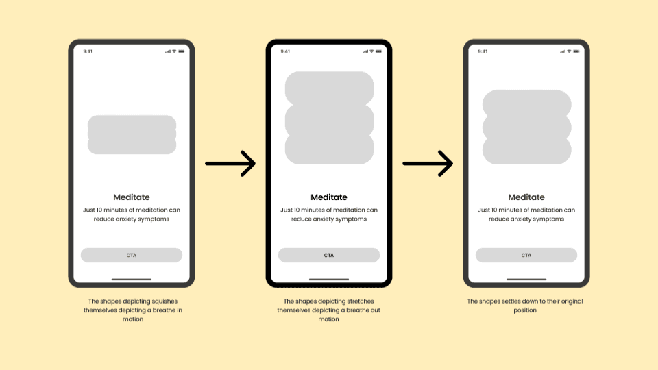
i jumped into figma and created low fidelity wireframes for what i was thinking and how the motion would look like.


improvements
sometimes in the excitement of animating stuff we forget why and who is this for.
one of the earlier animation i made for observe was not clicking. although it looked flashy, that was not the goal. also the timing of this animation was not consistent like other two animations. it was too fast. so to correct that another exploration was done so that it stays consistent and relevant in context with the app.
pushed further
it was not required but i created 3 interactive icons in rive too. if i look at them, these 3 are not at all related with each other lol.

[UTC +5:30]
BOOK A CALL